THE PROBLEM
As thousands of students navigate to the website everyday, an outdated landing page means thousands of missed opportunities to communicate new products and updates. Thus, how might we leverage the landing page space to be an efficient modem of Berkeleytime’s features and team mission while maintaining a cohesive brand identity?
The landing page lacks clarity in communicating its expanded feature catalog and fails to effectively convey the team's mission and values.
Goal: A visually interesting yet compelling communicator of Berkeleytime in one page ✨
Having worked on designer-only teams in the past, working cross-functionally with developers was new but fruitful. Although the sky is the limit for design exploration, when it comes to fleshing out solutions, feasibility is a tighter bound. Meeting in the middle was a new challenge, but one that taught me how to approach design with a realistic and team-oriented eye!
Bridging cross-functional teams!
Given the projected timeline, we simply didn’t have enough time to flesh out the details of the branding and building out a full branding guide. It would’ve been helpful for other page redesigns and future marketing work. This has been added to the lineup for future semester’s work though- stay tuned!
More in-depth branding
03 Design Critique
We rounded it out by conducting a deep-dive critique on the original landing page, dissecting its strengths and, more crucially, its shortcomings.
The original landing page had a static and passive interface, mostly informational that didn’t fully encapsulate Berkeleytime’s brand or mission.
Our goal was to redesign a platform that reimagined the landing page as dynamic, interactive and friendly— one that authentically resonated with our ethos: made by students, for students.
After several iterations and crit, we found that having strong use of color (Berkeleytime’s blue) with a larger graphic and title contributed to a strong brand presence on the landing page. We also wanted to include a curved line, as it added fluidity and motion into an otherwise static page and worked well as a smooth segue into the rest of the page, drawing the viewer’s eye downwards.
Once we had a solid idea of layout, I started on illustration of the Campanile, an iconic bell tower that represents Berkeley and payed homage to the original graphic.
Based on Iteration 2, we had an idea of playing around with the Campanile’s shadow, leading to some clever ideas of shifting the shadow based on time.
CONTEXT
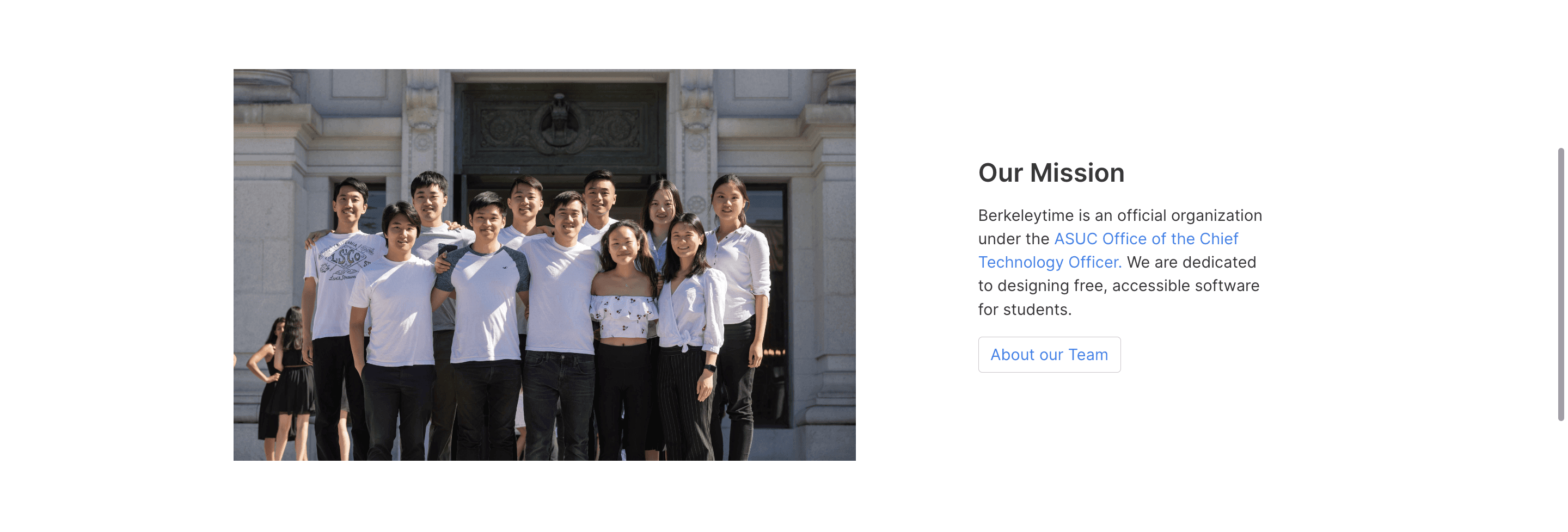
Since its launch in 2018, Berkeleytime’s landing page hasn't changed, but its reach and user base has grown to 28k students! The landing page is the main entry point for users- yet it doesn’t effectually serve as a key communicator of Berkeleytime’s purpose and values.
REFLECTION
Note: This project’s implementation is currently in development with backend!
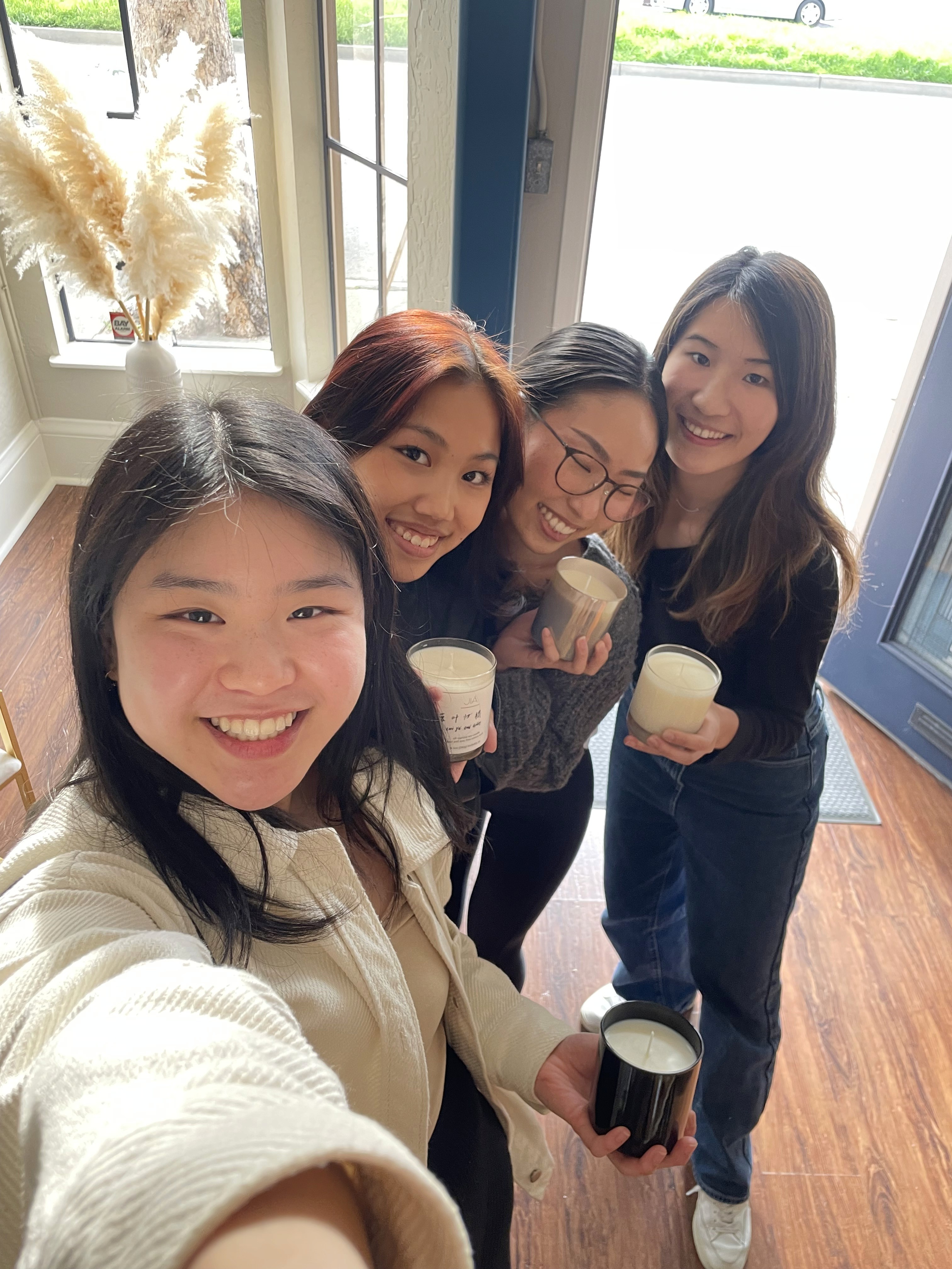
Berkeleytime Design Team dinner
with Michelle, Carissa, & Joanne!
02 Competitor Analysis
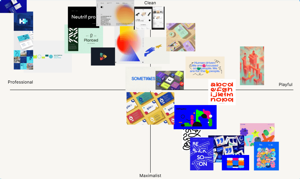
We also conducted competitor analysis by looking at other club and organization pages with similar student-oriented goals to gain a better understanding of how they visually expressed themselves and showcased their mission. Elements we looked for included page layout, illustration or graphics, and general sense of branding communication.


Simple yet powerful mission statement title
Gradient and animated blobs add movement
Bold illustration that speaks about the team
Simple yet dynamic graphics related to use
Representative illustration that draws attention
THE PROCESS
We took a threefold approach to identify the goals for our redesign: branding analysis, competitor analysis, and a current landing page critique.
01 Branding Analysis
We firstly revisited our current branding to understand what Berkeleytime portrayed itself as to students. Berkeleytime toes the line between professional (as an official on-campus organization) and casual, that values transparency, accessibility, and empowers students to make informed decisions. Thus, the tone we wanted to convey was welcoming and friendly, but helpful and simple to use.

where we are!
General Ideas
fine line between professional & casual
lean more casual to be more welcoming
clean, playful, versatile
appealing to most audiences
Berkeleytime Values
accessibility
transparency
empowering students to make informed decisions
dependability & reliability
catered to everyone, not just one group
Team Values
Growth
Curiosity
Passion
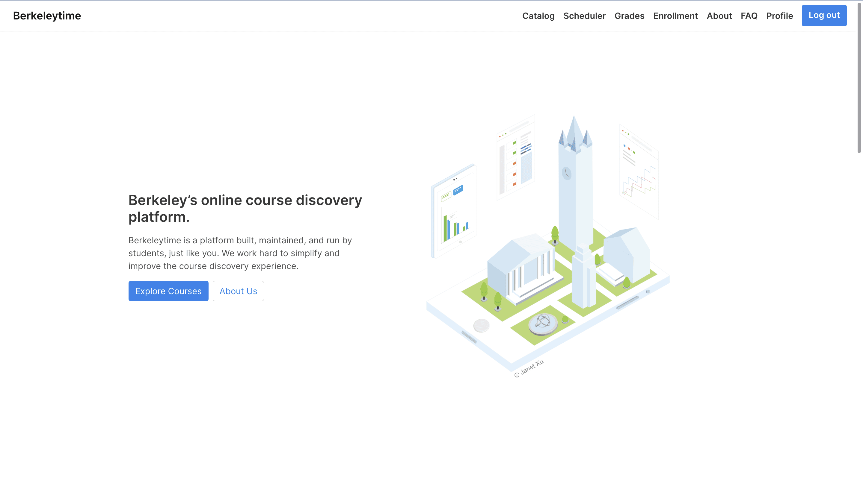


Lacks clear brand identity
Features aren’t updated
and don’t showcase
full functionality
Outdated team photo
Copy is vague and unclear
about what the team does
Unnecessary CTA to
“About Us” page
Redundant CTA to the
one above
Static graphic that blends
easily into negative space
Icons are inconsistent with
the rest of the site
IDEATION
Based on our analysis, we summarized our redesign goals to be shaping a dynamic user experience, encouraging feature exploration, and maintaining a strong brand identity.
We split the page into 3 main sections: landing (name and illustration), showcase (features), and about (informational). The purpose of this was to efficiently segment work on a small team, and to gain a better understanding of each section’s role and the interactions between them. I spearheaded the top landing section; my design decisions revolved around crafting a compelling experience, inviting the user to explore other parts of the site or page.
Note: Our designers tend to iterate in mid-fi and above. This is because we have an existing design system and strong sense of the product. Additionally, since we have tight turnaround times and work with developers, we iterate on versions that we can present quickly and wholly.
Welcome to Berkeleytime!
Berkeleytime is a platform built, maintained, and run by students, just like you

❌ LACK OF CTA
No buttons to redirect users, relying on the nav bar to do so instead
❌ SEPARATED NAV BAR
The color distinction makes the nav bar
feel cut off from the rest of the page
❌ FEELS LIKE A HOME PAGE, NOT A LANDING PAGE
Doesn’t capitalize on space to encourage user exploration
Berkeleytime
Catalog
Scheduler
Grades
Enrollment
About
Log in
Welcome to
Berkeleytime!
Built, maintained, and run by students, just like you.
01 CATALOG
04 enrollment
02 grades

FAQ
03 SCHEDULER
❌ AWKWARD MISSION STATEMENT POSITIONING
Doesn’t follow natural text hierarcy, and is easy to miss
❌ COLOR CUT OFF FEELS DISJOINTED
Dividing the sections too harshly takes away
from a seamless and continuous landing page
❌ INCONSISTENT LINK STYLE
These don’t resemble our tyical link style, which might lead to user confusion and drift from our brand
Campanile
illustration placeholder!
Berkeleytime
Catalog
Scheduler
Grades
Enrollment
About
FAQ
Log in
Welcome to
Berkeleytime!
Berkeleytime is a platform built, maintained, and run by students, just like you.

❌ LACK OF CTAS
Missed opportunity to redirect users to products
💚 BOLDER TITLE AND GRAPHIC
Sizing up elements creates a compelling
and engaging visual experience
💚 NON-LINEAR LINE ADDS DYNAMISM
Having a curved line adds movement and visual interest, while smoothly transitioning the viewer’s eye down towards features
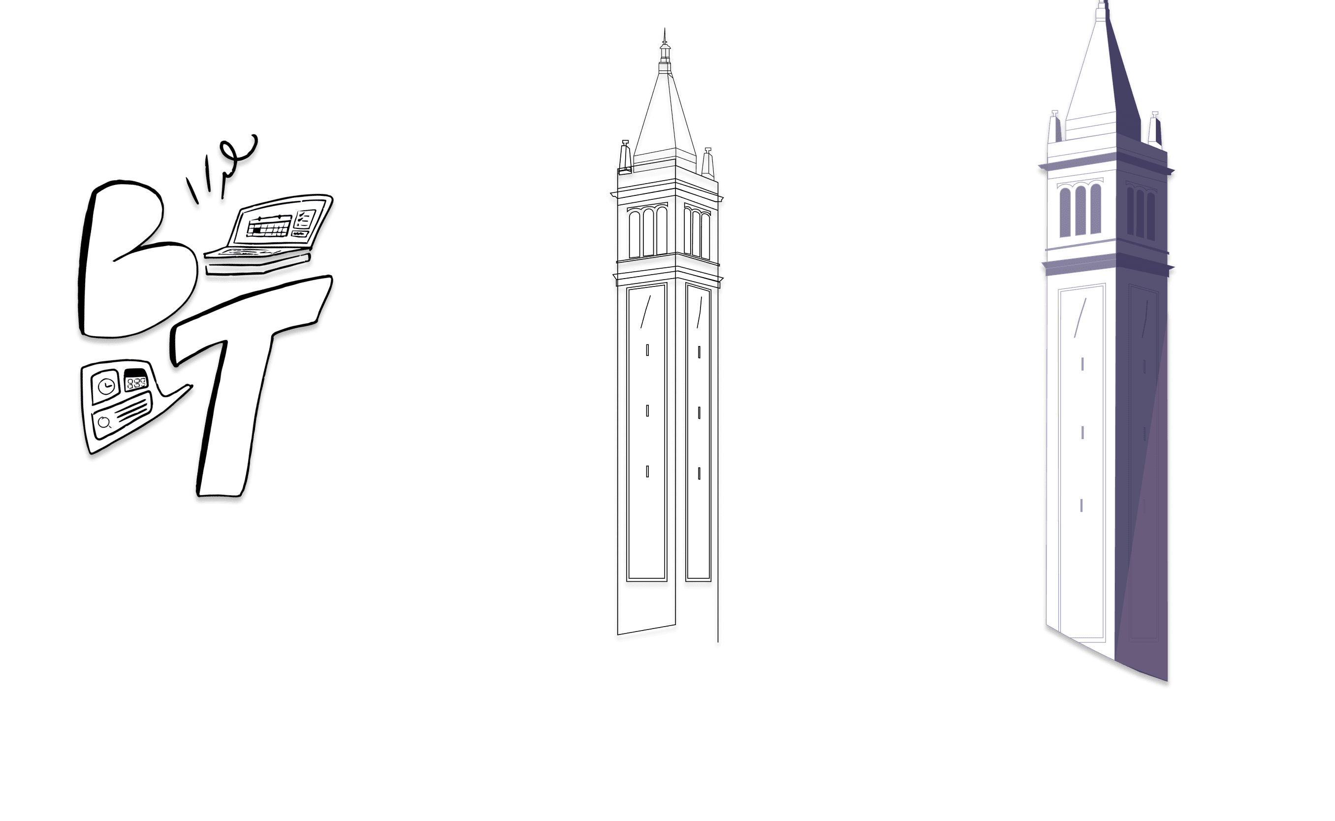
We quickly figured out feasibility might be an issue, as it might cover the feature showcase right below it and accounting for all times of day was technically difficult. Still, we liked the idea of implementing an easter egg, and decided to play into the time changing aspect with gradients and color instead. We pulled our colors from other pages to maintain consistency across the site.
Berkeleytime
Berkeleytime is a platform built, maintained, and run by students, just like you.
Enrollment
Grade Distribution
Scheduler
Course Catalog
Welcome to
Berkeleytime!
Berkeleytime is a platform built, maintained, and run by students, just like you.
Welcome to
Berkeleytime!
Berkeleytime is a platform built, maintained, and run by students, just like you.

sunset
twilight/dawn
twilight/dawn
early morning
mid morning
afternoon
E4A70A
FF7500
DFCA6B
26C9A5
4FB4FF
76A6FF
FF9EB0
FFAE74
ADA6FD
D45C72
161646
10101A
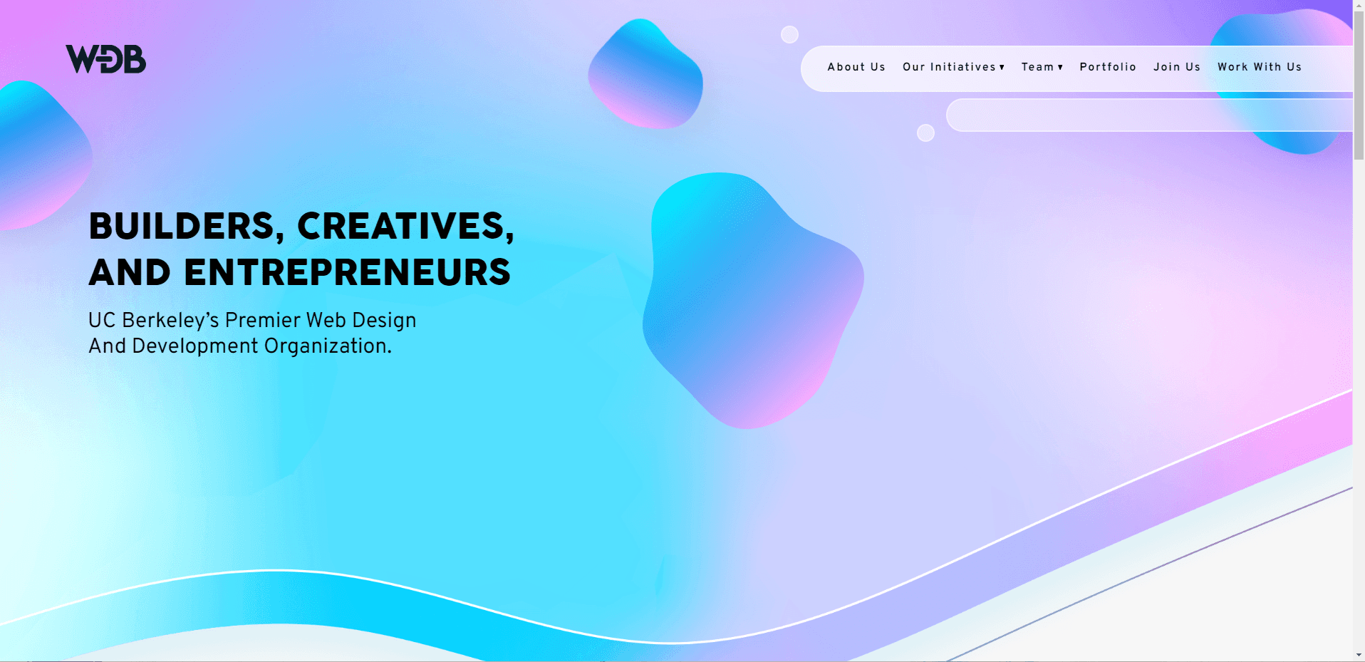
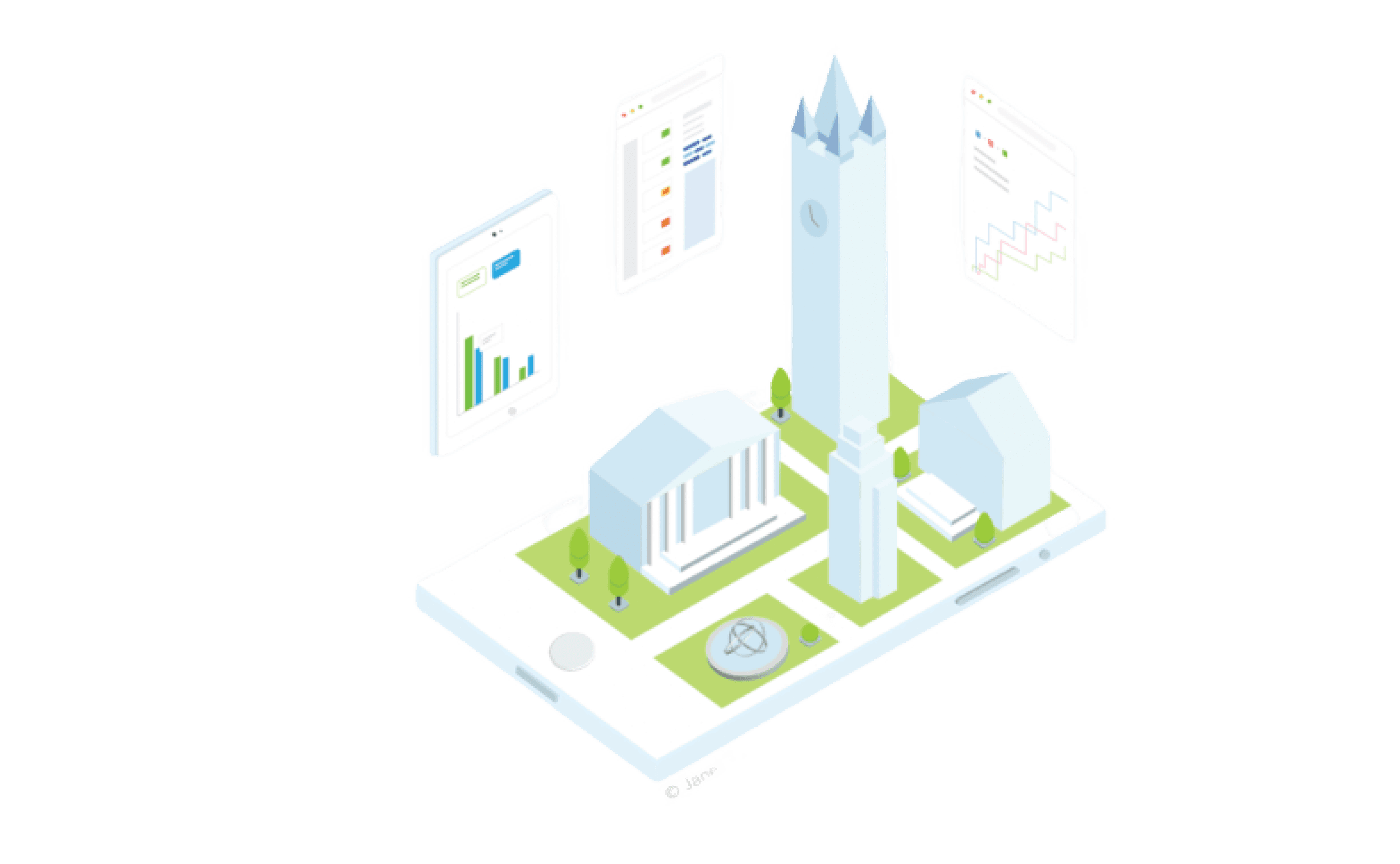
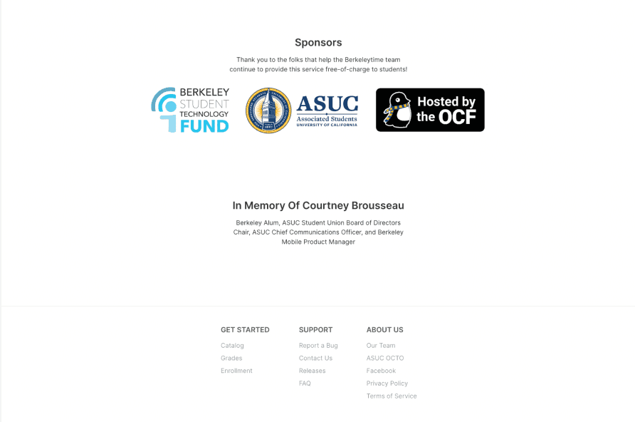
OUR SOLUTION
Introducing the new Berkeleytime landing page experience!
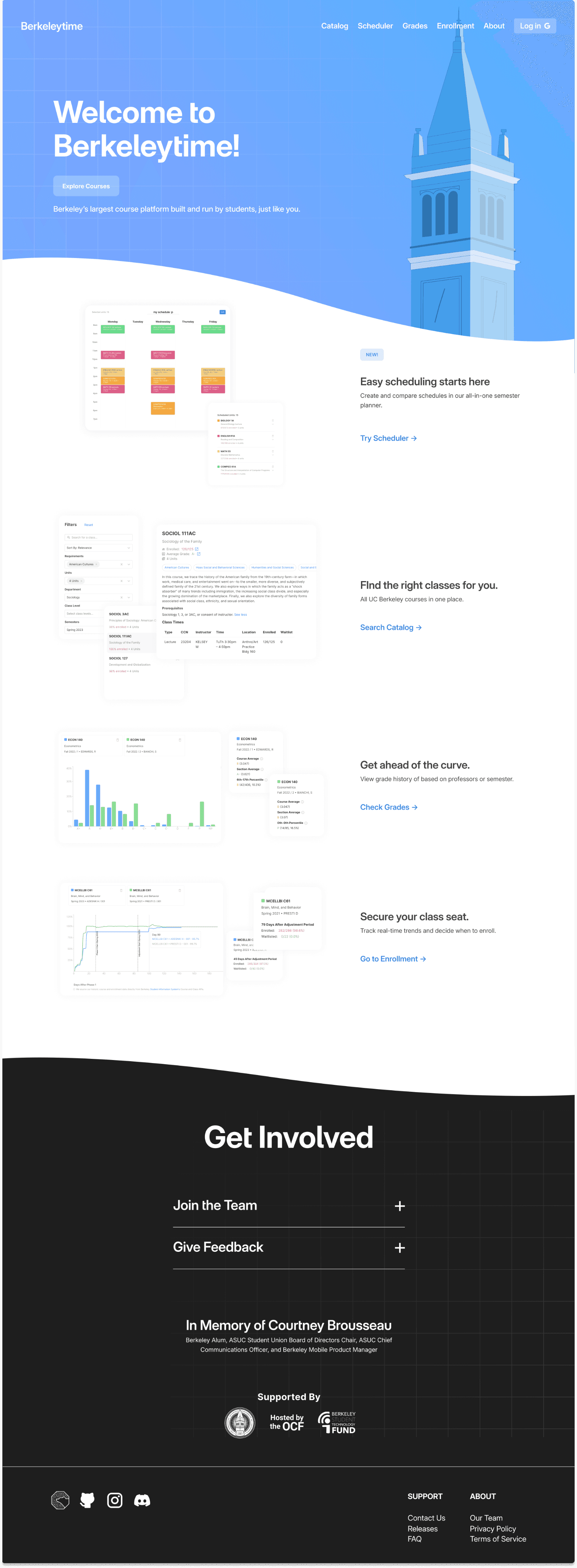
seamless nav bar
high-visiblity CTA
to promote products
pictures that float in, adding movement and reducing text on page
additional curve to maintain sense of flow
black footer to reduce eyestrain and contrast the bright header
eye-catching tag that showcases newly released products
easy links to directly access features
action-oriented copy to encourage feature use
accordion to show information if expressly looked for
large illustration
that matches branding
bold use of core color while using a gradient to soften
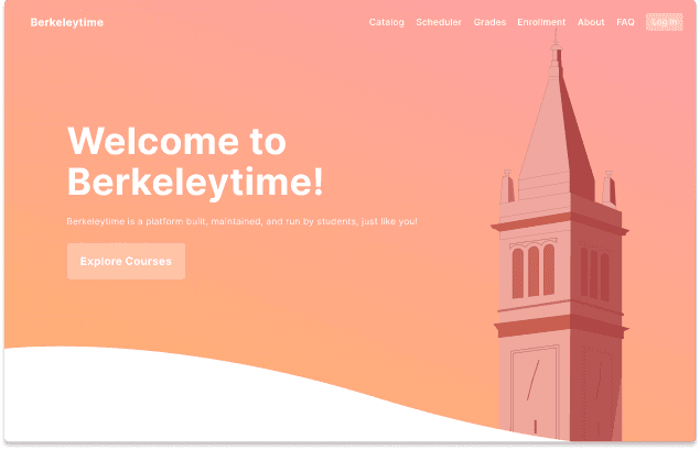
EARLY MORNING
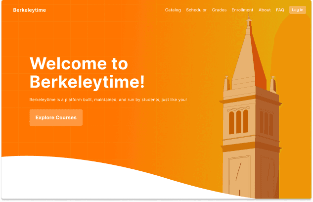
SUNSET
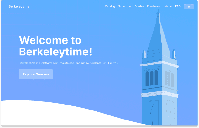
MID MORNING
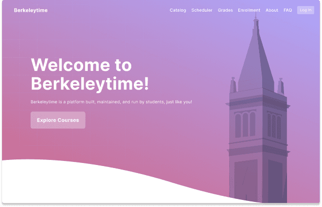
TWILIGHT/DAWN
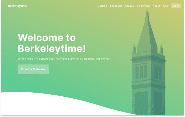
AFTERNOON
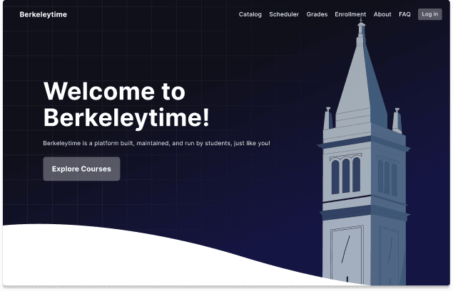
NIGHT

TIMELINE
Oct — Nov 2023
5 weeks
TOOLS
User Interviews
Braze
FigJam
SKILLS
UX Research
User Interviews
Observation Study
Journey Mapping
Insight Synthesis
Berkeleytime — Landing Page
Berkeleytime reimagines the student course planning experience to be seamless, integrated, and centralized across all disciplines. Made by students, for students.
TIMELINE
Spring 2023
4 weeks
TEAM
1 Product Manager
4 Designers
4 Developers
SKILLS
UX/UI Design
Branding
Illustration
ATTENTION!
This page is still being updated to match the rest of this site. Feel free to take a look below though!
